
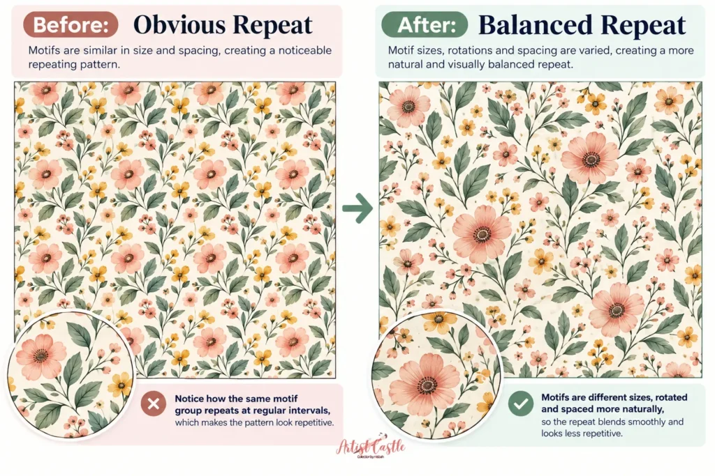
You built your tile. The edges line up. Illustrator or Photoshop shows a clean, gapless repeat. And yet — the moment you fill a larger area with it, you can see exactly where each tile starts and ends. Stripes appear. Diagonal lines cut across the design. A single flower keeps popping up in the same spot like a bullseye. If you’re wondering why your seamless pattern looks repetitive even though the edges match perfectly, the problem is usually visual balance rather than the seam itself.
This is one of the most common frustrations in surface pattern design, and it comes down to one distinction: technically seamless and visually balanced are not the same thing.
A tile is technically seamless when its edges match — nothing clips, nothing gaps. But once that tile repeats dozens of times across fabric, wallpaper, or a printed sheet, your eye stops looking at one square and starts reading the whole surface. And the human eye is very good at spotting patterns within patterns — rows, diagonals, clusters, and stand-out shapes — even when the underlying math is perfect.
First, make sure you’re solving the right problem
Before going further, it helps to rule out two other common issues that get confused with this one:
- If you’re seeing thin white lines or actual gaps at the seams (not a repetitive look, but a literal crack), that’s usually a construction or export issue rather than a design one. Our guide on seamless pattern white lines walks through the causes and fixes for every major tool.
- If your pattern feels cramped, sparse, or the motifs seem the wrong size for the repeat, that’s a scale and density question. See Pattern Repeat Size vs. Motif Scale for how to think about that trade-off.
- If your tile joins perfectly and the sizing feels right, but the repeat is still obvious once it’s tiled out — that’s what this article covers.

Why does my seamless pattern look repetitive even when the tile is perfect?
Your eye doesn’t evaluate a pattern one tile at a time. It scans across the whole surface and automatically groups things together — elements that are close to each other, elements that look similar, and shapes that seem to continue in a line. This is a well-established area of visual perception known as Gestalt psychology, and it’s the reason a tile that looks balanced in isolation can fall apart once it’s multiplied: proximity pulls nearby elements into a group, similarity links matching shapes across the surface, and “good continuation” leads the eye to follow anything that looks like a line — including one your repeat created by accident.
If two similar shapes happen to line up across the seam, your eye connects them into a row. If a gap of empty space repeats at a regular interval, your eye reads it as a hole, not as breathing room. None of this is a flaw in your file — it’s a side effect of how repetition works once you scale past a single tile.
Below are the specific ways this shows up, roughly in order of how often they trip people up.
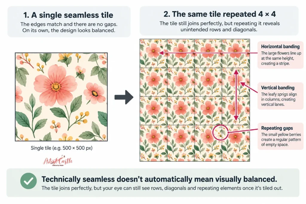
Banding (stripes across the surface)
Banding happens when motifs — or the gaps between them — land at the same height or the same side-to-side position across every tile. Instead of an even field, you get a corridor of motifs (or empty space) running straight across the fabric like a stripe you never intended.
This is most common in straight, grid-style repeats, because a straight repeat has no offset to break up that alignment. If you look at your pattern and see an accidental horizontal or vertical “lane,” this is almost always why.
Fix: Nudge motifs so they don’t share the same vertical or horizontal position tile-to-tile, or move to a repeat structure that offsets columns or rows (more on that below).
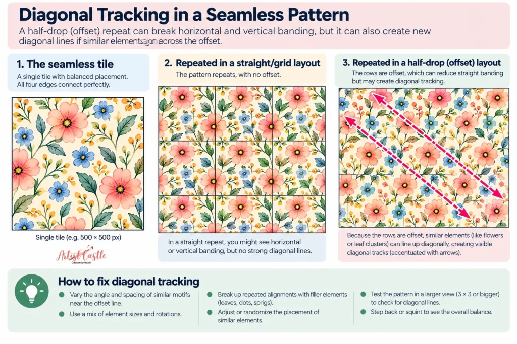
Diagonal tracking (“rivers”)
This is the diagonal version of banding — a channel of empty space or a chain of similar motifs that your eye follows at an angle across the whole surface. It often shows up after someone fixes a straight-repeat banding problem by switching to a half-drop or brick layout, because that offset introduces a new diagonal relationship between tiles that wasn’t there before.
Fix: Vary the angle, spacing, or scale of the motifs that sit near the offset line, so nothing lines up cleanly along that new diagonal.
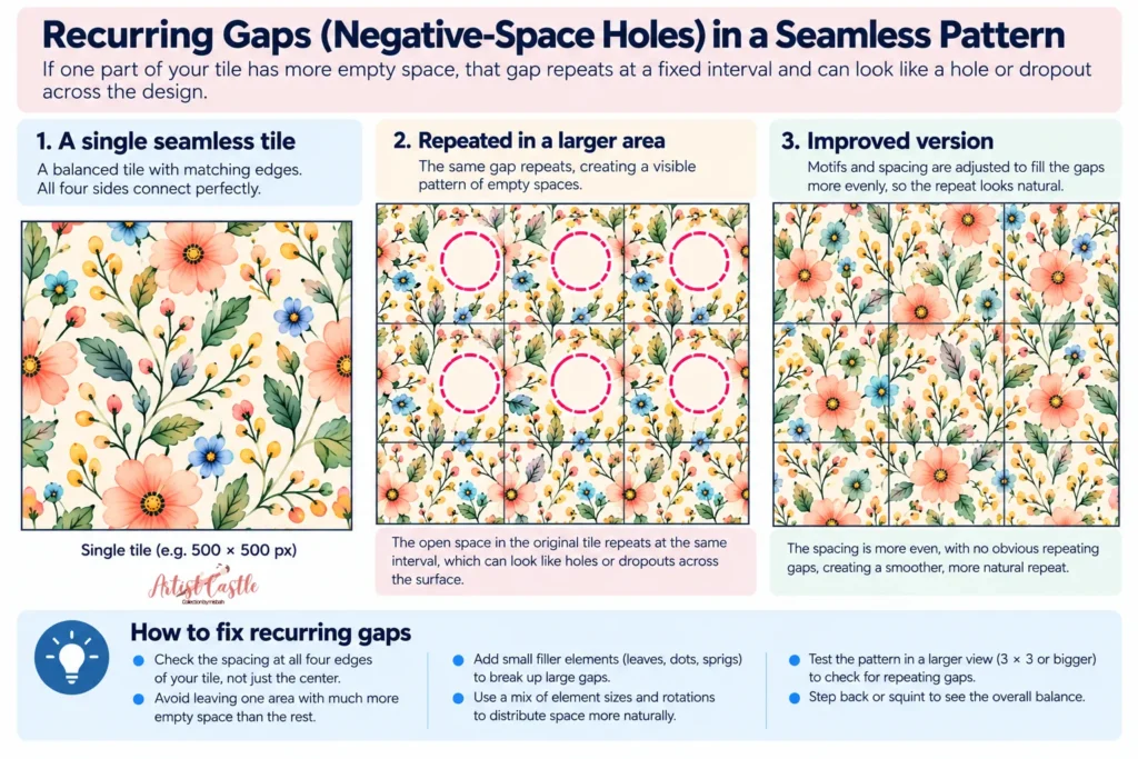
Recurring gaps (negative-space holes)
If one part of your tile has noticeably more empty space than the rest, that gap doesn’t stay a one-off — it repeats at a fixed interval across the whole surface, and starts reading as a hole or a dropout rather than a deliberate pause.
Fix: Check spacing at all four edges of your tile, not just the interior. A common cause is designing comfortably in the center of the canvas and only thinking about the edges once the tile is “done” — by then, the edge gaps are often uneven compared to the interior.
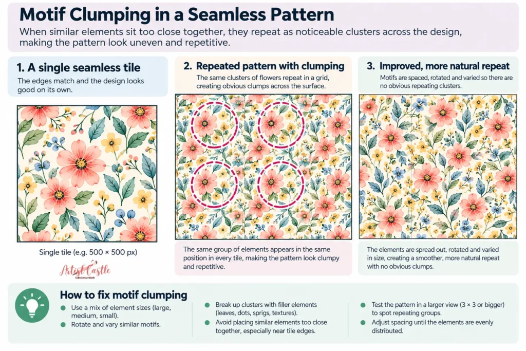
Motif clumping
The opposite problem: motifs bunch up in one area of the tile and leave the rest sparse. Tiled across a surface, those clusters fuse into little “islands,” and the empty zones between them become their own visible pattern.
Fix: Distribute motifs more evenly across the full tile, including right up to the edges — elements that cross a boundary and continue on the opposite side are one of the most reliable ways to avoid both clumping and obvious seams at once. Letting a stem, vine, or ribbon travel across the tile edge and pick up again on the other side is a technique long associated with textile designers such as William Morris, and it still works for the same reason today: a continuous line gives the eye something to follow instead of a seam to spot.
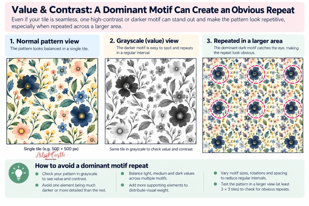
One motif stealing all the attention
Sometimes every individual shape is placed thoughtfully, but one motif is simply louder than the rest — darker, more saturated, or just bigger — and your eye keeps snapping back to it every time it repeats. Instead of scanning smoothly across the design, your eye jumps from one instance of that motif to the next, and that rhythm exposes exactly where the repeat lands.
Fix: Tone down the contrast or saturation of the standout element, or add a second element of similar visual weight elsewhere in the tile so the eye has more than one place to land.
Accidental grids (latticing)
Organic or scattered motifs can accidentally line up into a rigid checkerboard or diamond grid if their spacing is too even or their outer edges keep aligning the same way. The result feels stiff and mechanical even though every individual shape is organic.
Fix: Break up uniform spacing with irregular rotation and varied distances between motifs, rather than placing everything at consistent intervals.
Motifs that all face the same way
If every motif points in roughly the same direction — the same stem angle, the same gaze, the same lean — the whole pattern picks up a strong directional pull, and that pull tends to line up across tile boundaries into a visible drift.
Fix: For scattered or “tossed” layouts especially, mix in motifs facing different directions so no single direction dominates.
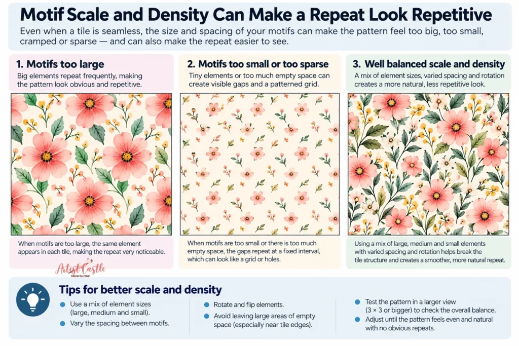
Repeat size can make small issues bigger
A smaller tile repeats more often across the same physical area, so any of the issues above get magnified faster. This isn’t a reason to always go bigger — some products call for a compact repeat — but if you’re already fighting a visible repeat and can afford to enlarge the tile slightly, it buys you more room to break up alignment. For a deeper look at choosing repeat size relative to your motifs, see Pattern Repeat Size vs. Motif Scale.
The half-drop trade-off
Switching from a straight repeat to a half-drop (offsetting alternating columns by half the tile height) is one of the most common fixes for banding — and it works, because it breaks up the straight horizontal and vertical alignment that causes stripes.
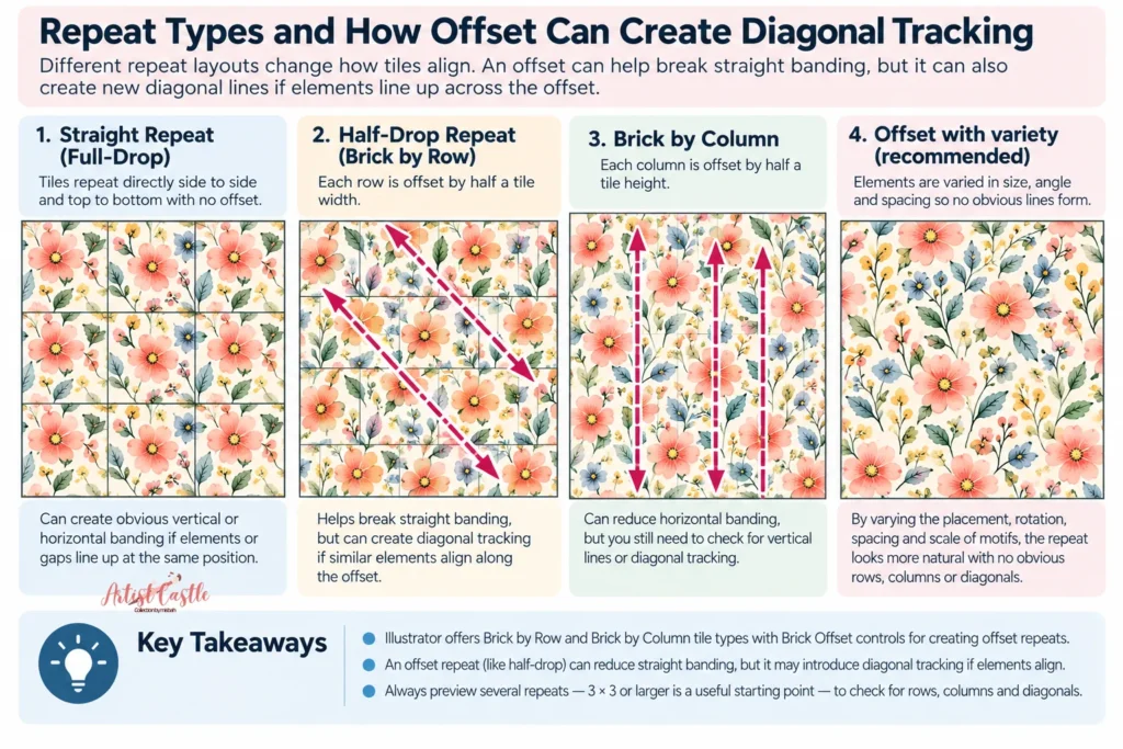
But a half-drop isn’t an automatic fix. Illustrator’s Pattern Options panel offers Brick by Row and Brick by Column tile types, each with a Brick Offset control for building this kind of staggered repeat — Brick by Column is the one that produces a vertical, half-drop-style offset. Whichever offset you use, it introduces a new relationship between tiles, and if your motifs happen to line up along that offset, you’ll trade horizontal or vertical banding for diagonal tracking instead. It’s a genuinely useful tool, but treat it as a different trade-off, not a guaranteed cure — check the result at full scale before assuming it’s solved the problem.

How to actually test for this
You can’t catch most of these issues by looking at one tile on its own. A tile that looks balanced in isolation can fall apart the moment it’s repeated. Here’s a simple way to check:
- Tile it out, don’t judge one square. Use your software’s repeat preview (Photoshop’s View > Pattern Preview, or Illustrator’s swatch fill) to preview several repeats, not just the single artboard — 3×3 or larger is a useful starting point.
- Zoom out. Look at the pattern from a distance, or shrink it down on screen the way it will actually appear on a garment, cushion, or wallpaper panel rather than filling your monitor.
- Check for lines and directions, not just individual motifs. Scan for stripes, diagonals, and any shape that seems to repeat in a visible line.
- Squint, or blur it slightly. Squinting (or applying a light blur in your software) fades out fine detail and makes color/value clusters much easier to spot. If one area reads as noticeably darker or lighter than the rest once blurred, that’s often your eye-jump culprit.
- Find the strongest repeating feature. Ask yourself: if I had to point to the one thing giving away the repeat, what would it be? That’s usually the highest-priority fix.
- Fix one thing, then retest. Change one variable — spacing, an offset, a color value — and re-check the tiled view before making another change. Fixing several things at once makes it hard to tell what actually worked.
This loop — tile, zoom out, scan, fix one thing, retest — is more reliable than trying to spot every issue in a single pass.

FAQ
Does switching to a half-drop repeat fix a repetitive pattern?
It can fix horizontal or vertical banding, but it introduces a new diagonal offset between tiles. If your motifs align along that offset, you’ll end up with diagonal tracking instead of stripes. Always check the tiled result before assuming it’s solved.
Why does my pattern look fine at 100% zoom but repetitive when tiled out?
Because a single tile doesn’t show you how motifs interact across the seam with the next tile. Issues like banding, tracking, and clumping only become visible once you view several repeats together — which is why previewing several repeats, 3×3 or larger, is worth the extra step.
Can I fix a repetitive-looking pattern without starting over?
Usually, yes. Most of the issues above (uneven spacing, one motif that’s too dominant, everything facing one direction) can be adjusted without rebuilding the tile from scratch — it’s more often a matter of nudging existing elements than redrawing them.
Is a smaller repeat unit always worse for hiding tiling?
Not automatically, but a smaller tile does repeat more often across the same area, so any imbalance in it shows up more frequently. If you’re already dealing with a visible repeat, a slightly larger tile can give you more room to work with.
My tile edges match perfectly — so why does it still look tiled?
Matching edges only guarantees there’s no gap or overlap at the seam. It doesn’t guarantee the motifs are distributed evenly enough across multiple tiles to avoid stripes, diagonals, or clusters — that’s a separate, compositional issue, which is what this article addresses.
Sources used
- Adobe Illustrator official documentation — Pattern Options panel, Tile Type settings (Grid, Brick by Row, Brick by Column), and Brick Offset: helpx.adobe.com/illustrator
- Adobe Photoshop official documentation — Pattern Preview (View > Pattern Preview): helpx.adobe.com/photoshop
- ArtistCastle: Why Does My Seamless Pattern Have White Lines?, Pattern Repeat Size vs. Motif Scale