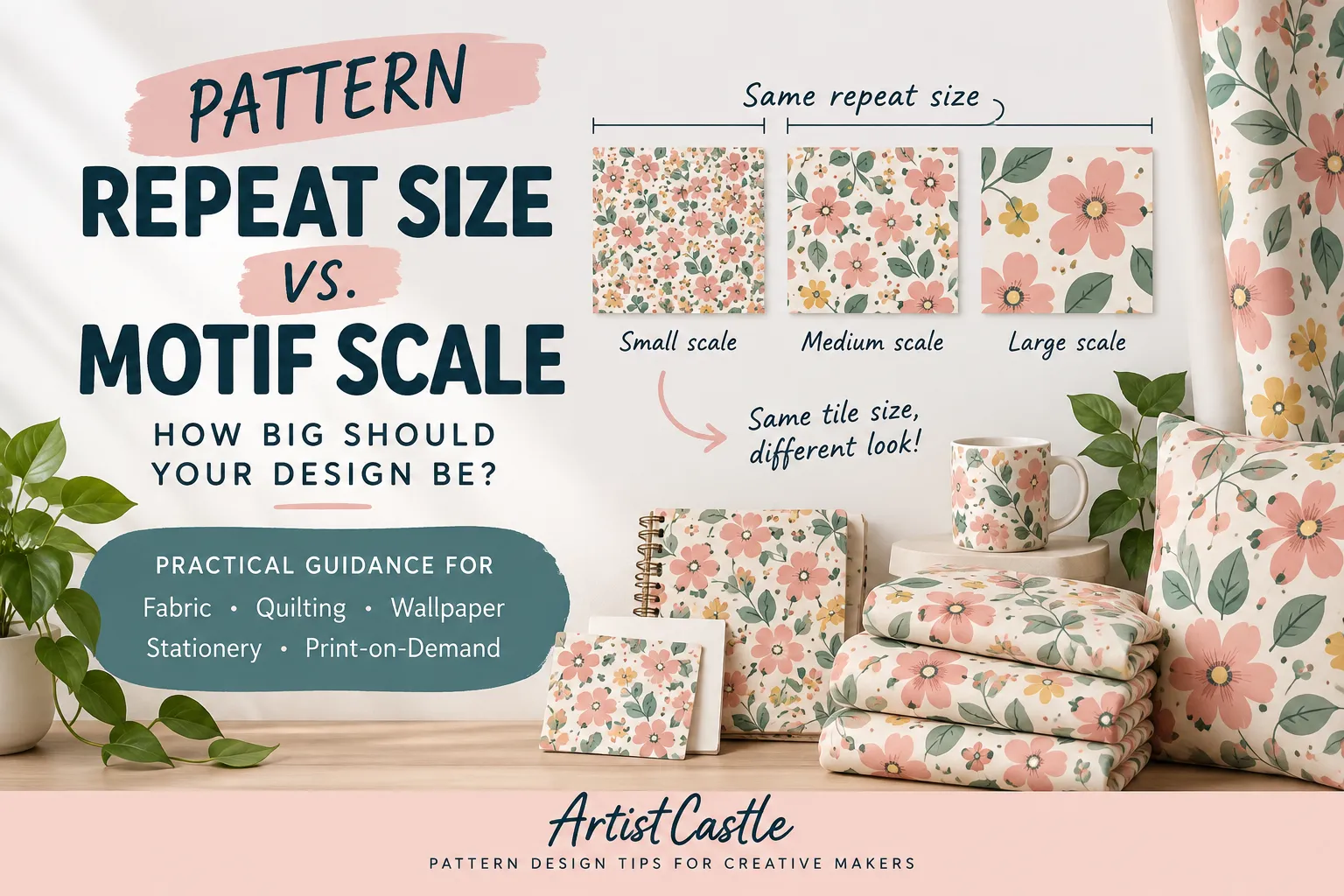
“How big should I make my pattern?” is one of those questions that sounds like it should have a single correct answer. It doesn’t. Part of the confusion is that the question is usually really two questions tangled together: how big is the repeating tile itself, and how big do the motifs inside it look? Those are two different design decisions, and mixing them up is where most of the “is this too big / too small” second-guessing comes from.
Understanding pattern repeat size vs motif scale can be confusing because the two measurements affect a design in very different ways.
This guide separates the two, explains what genuinely is a fixed technical constraint versus what’s a creative choice, and walks through how to think about scale for fabric and apparel, quilting, wallpaper, stationery and digital paper, and print-on-demand — without pretending there’s a universal inch measurement that applies to all of them.
Quick Answer
- Is there a correct pattern repeat size or motif scale? No. There’s no single “right” size for either one. The repeat tile’s dimensions and the motifs’ scale are two separate decisions, and the best size for both depends on the product, the platform or manufacturer’s requirements, and the visual effect you’re going for.
- What’s the difference between repeat tile size and motif scale? The repeat tile is the physical or pixel dimensions of the block that gets duplicated edge-to-edge. Motif scale is how large the individual design elements look, relative to that tile, to the product, and to the person looking at it.
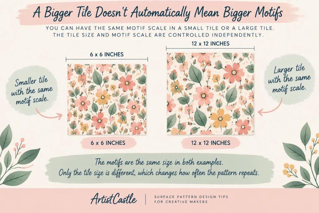
- Does making the tile bigger make the motifs bigger? Not by itself. A larger tile just gives you more room — you can fill it with bigger motifs, the same motifs with more space around them, or more small motifs. The tile’s dimensions and the motifs’ size are controlled independently.
- How do I know what scale is right for my product? Think about how the finished product will actually be seen and used — held close, worn, cut into pieces, or viewed from across a room — and test your design at its true physical size before finalizing it, rather than judging scale from a zoomed-in screen preview.
Repeat Tile Size vs. Motif Scale: Two Different Measurements
It’s worth being precise about the vocabulary here, because the two terms get used interchangeably even though they describe different things.
- Repeat tile size (or pattern block, repeat unit): the width and height of the single block of artwork that gets duplicated, edge to edge, to build the continuous pattern. This is a fixed measurement — in pixels, inches, or centimeters — and it’s what our guide to seamless pattern size, DPI and pixel math walks through in detail, including how the same tile can print at a completely different physical size depending on the resolution a platform uses.
- Motif: a single design element inside the tile — one flower, one dot, one animal, one geometric shape.
- Motif scale: how large that motif reads, relative to the tile it sits in, the product it’s printed on, and the distance from which it’s typically viewed. This is a relative, contextual judgment — not a fixed number.
You can have a small tile with one large motif that gets deliberately cropped at the edges, or a large tile scattered with dozens of tiny motifs. Neither is “wrong” — they’re just different design decisions doing different jobs.
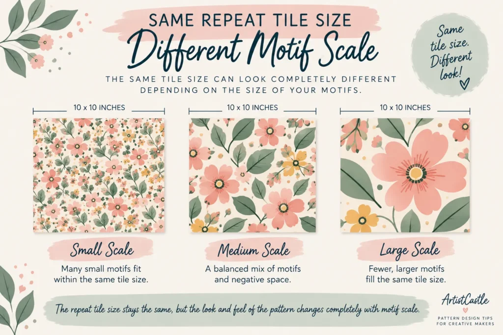
Why Making the Tile Bigger Doesn’t Automatically Make the Motifs Bigger
This is an important distinction in pattern sizing, so it’s worth stating plainly: the size of your repeat tile and the size of the motifs inside it are controlled independently.
Expanding your artboard or canvas from, say, 6 inches to 18 inches doesn’t stretch your existing motifs to fill the new space — it just gives you more room. What you do with that room is up to you: keep the same small motifs and add more negative space around them, add more motifs at the same size, or redraw them larger. The tile’s dimensions set the boundary of the repeating container; they don’t dictate what’s drawn inside it.
Adobe’s own documentation for Illustrator’s pattern tools reflects this same separation: the Pattern Options panel lets you set the tile’s Width and Height independently of the artwork, or use “Size Tile to Art” to have the tile automatically match your artwork’s bounds — but either way, the tile dimension and the artwork’s own size are two distinct settings, not one and the same value.
The flip side of this is also true: if you resize or rescale the tile itself (for example, by changing its pixel dimensions or the resolution it’s printed at), everything inside it — including your motifs — scales proportionally along with it. That’s a different situation from redesigning the motifs, and it’s exactly the mechanism explained in our pixel math and DPI guide: change the resolution a file is printed at, and the whole tile — motifs included — comes out at a different physical size, even though nothing in the artwork itself changed.
Density and Negative Space: The Third Variable
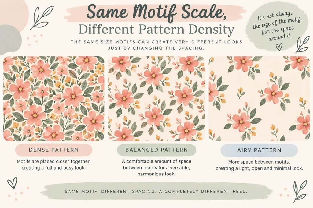
Once you’ve separated tile size from motif scale, there’s a third factor that shapes how a pattern reads: density — how much of the tile is covered by motifs versus left as open background (negative space).
The same motif, at the same scale, can look completely different depending on how densely it’s packed:
- Sparse / tossed layouts leave generous negative space around each motif, letting individual shapes stand out as distinct focal points.
- Dense / allover layouts pack motifs close together or let them touch and overlap, so the pattern reads more like a continuous texture than a set of separate elements.
Negative space isn’t “unfinished” space to be filled in — it’s an active part of the composition. A pattern with generous breathing room and one with tightly packed motifs can use the exact same tile size and motif scale and still feel like entirely different designs. When you’re evaluating whether a pattern “feels” too busy or too sparse, it’s often density you’re reacting to, not the motif scale itself.
“Small,” “Medium,” and “Large” Are Relative — Not Fixed Inch Ranges
You’ll see designers and marketplaces describe patterns as small-scale, medium-scale, or large-scale (sometimes “ditsy” for very small, “statement” or “hero” for very large). These are useful, widely understood terms — but they’re relative descriptions, not agreed-upon inch measurements. A “large” motif for a baby’s onesie and a “large” motif for a living room curtain are not remotely the same physical size, because they’re being judged against completely different products and viewing distances.
Rather than looking for a fixed number to hit, it’s more useful to ask relative questions:
- How big is this motif compared to the repeat tile it sits in?
- How big is it compared to the finished product — a sleeve, a cushion, a full wall?
- How big will it look from the distance it’s actually going to be viewed at — held in the hand, worn, or seen from across a room?
The same motif, scaled up, tends to read as bolder and more graphic; scaled down, it tends to read as more delicate or textural. Neither effect is objectively better — it’s a creative choice tied to the mood you’re going for.
Matching Scale to Your End Product
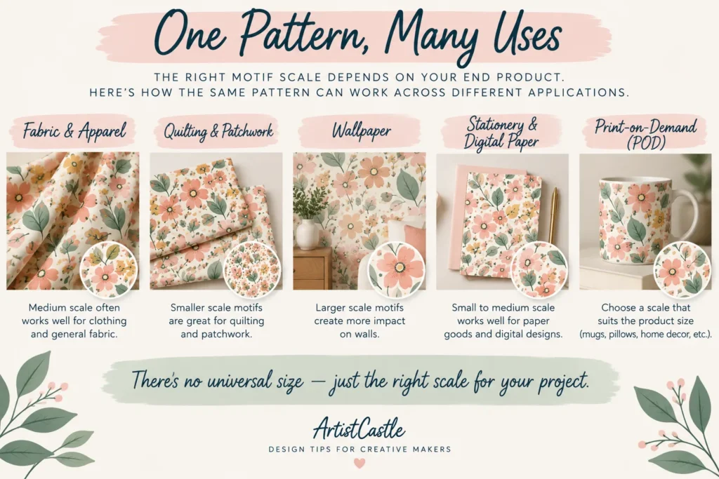
The most reliable way to choose a scale isn’t a formula — it’s thinking through how the specific product gets made, cut, worn, or displayed. Here are the practical considerations for the product types ArtistCastle designers most often work with. These are things to think about, not universal size rules to copy.
Fabric and Apparel
Garments are cut into panels, and those panels include seams, darts, and curves. A motif that looks great flat on your screen can end up sliced awkwardly across a shoulder seam or a side dart once the fabric is actually cut and sewn. If you’re designing for garments, it’s worth sketching or mocking up roughly where the main seamlines and cut edges will fall, so you can judge whether your motif scale will survive construction — rather than judging it purely as a flat, uninterrupted repeat.
Quilting and Patchwork Fabric
Quilting fabric gets cut into small, often uniform pieces — strips, squares, charm packs. A motif that’s beautiful as a whole can turn into an unrecognizable fragment once it’s chopped into a 2-inch square alongside a dozen other patches. If you know your fabric is likely to be used for patchwork, it’s worth testing how a section of your pattern looks when “cut” into a small square, not just how the full repeat looks as one piece.
Wallpaper
Wallpaper is viewed across a whole room, from several feet away, and it repeats many times up and down a wall. A very small, high-contrast motif can create a distracting visual “buzz” or make repeat lines more noticeable when it tiles dozens of times across a large surface — something that’s easy to miss when you’re only looking at one repeat on a laptop screen. If you’re designing for wallpaper, it’s worth mocking up (or at least imagining) a much larger section — several repeats wide and tall — before deciding the scale is right, rather than judging from a single tile.
It’s also worth noting that if you’re preparing a wallpaper design for a specific print-on-demand platform, the platform may have its own technical tiling rules that affect which tile widths work cleanly. Spoonflower, for example, states in its own Help Center that half-drop and mirror-repeat wallpaper designs must divide evenly into its fixed panel width so the pattern lines up correctly across seams when hung — that’s a real, platform-specific production constraint, separate from the creative scale decision, and it’s worth checking your specific platform’s current requirements before finalizing a wallpaper repeat.

Stationery and Digital Paper
Stationery, gift wrap, and digital paper for crafting are usually held close and viewed from a short distance. They’re also often cropped — a notecard, a gift tag, or a single scrapbooking layer might only show a small section of the full pattern. If your motifs are large relative to the finished piece, there’s a real risk that a card or tag only shows a fragment of one motif rather than the full design. Designing with a few smaller, complete motifs in mind — so at least one full motif is likely to land on a small cropped piece — is a reasonable safeguard, even though there’s no fixed “correct” motif size for this category.
Print-on-Demand (POD)
POD is the trickiest category for scale, because a single design file often gets applied across wildly different product sizes — a phone case, a tote bag, a throw pillow, a duvet cover — sometimes from the same upload. A scale that looks balanced on a small accessory can look sparse and lost on a large one, and vice versa. Most POD platforms offer a scale or zoom control on individual product listings for exactly this reason. If you’re listing one pattern across several very differently sized products, it’s worth reviewing (and adjusting) the scale separately for each product’s preview rather than assuming one setting works everywhere.
If you’re new to selling through print-on-demand more broadly, our beginner’s guide to starting a print-on-demand business covers how the wider process works, from choosing a supplier to pricing your products.

Test Your Design at Its Actual Physical Size
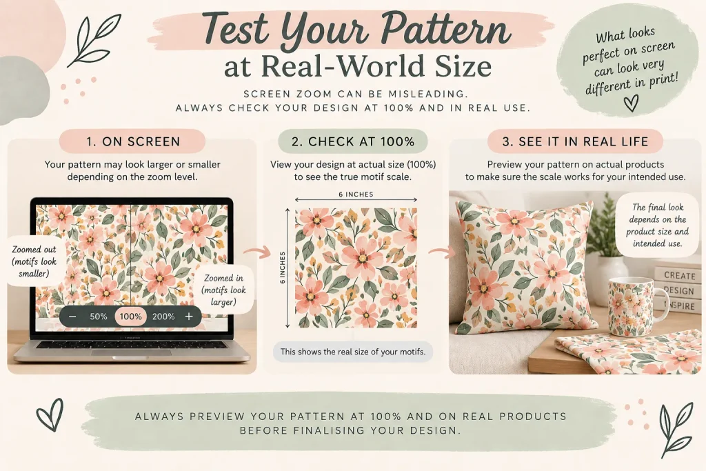
Many scale mistakes happen because a pattern is judged on screen at an arbitrary zoom level rather than at the size it will actually be printed and seen. A motif that looks perfectly balanced filling your laptop screen might print at half an inch or at two feet, depending on your file’s pixel dimensions and the resolution it’s printed at — the two numbers covered in detail in our pixel math and DPI guide.
A few habits help close that gap between what you see on-screen and what actually prints:
- Work out the physical dimensions your file will actually print at — pixel dimensions divided by the resolution your platform or printer uses — rather than trusting how large the design looks on your screen.
- Print a same-size proof where you can. Even a rough print on ordinary paper, taped together if needed, will tell you more about real-world scale than any on-screen zoom level.
- Mock the design onto the actual product shape — a garment panel, a cushion front, a wall section — rather than judging it as a flat, endless repeat.
- Step back from your screen (or view a mockup from across the room) to approximate how the finished product will actually be seen, especially for anything viewed at a distance, like wallpaper or upholstery.
- Order a physical sample before committing to a full print run, if the platform offers one. A screen preview, no matter how careful, can’t fully substitute for seeing and holding the real thing.
One more thing worth separating clearly: a design that’s the wrong scale is a different problem from a design with a genuine repeat flaw — a gap or misalignment at the tile’s edges. Both can show up as “something looks off” once a pattern is printed larger than it appeared on screen, but they have completely different causes and fixes. If your motifs are scaled the way you want but you’re seeing thin lines or gaps where the tile repeats, that’s a seam issue rather than a scale issue — our guide to fixing white lines and gaps in seamless patterns walks through how to tell the two apart and troubleshoot each one.
Common Scale Mistakes
- Assuming a bigger canvas means bigger motifs. As covered above, expanding your tile’s dimensions just adds more room — it doesn’t automatically resize what’s inside it.
- Judging scale only from a zoomed-to-fit screen view. Design software will happily show your pattern at whatever zoom level fits your window, which tells you nothing about its real printed size.
- Designing the motif without considering how the product is made or used. A motif that looks complete on your artboard might be sliced apart by a seam, hidden inside a fold, or cropped out entirely on a small product — think about construction and cropping, not just the flat repeat.
- Treating a repeat-edge flaw as a scale problem, or vice versa. A visible line at the tile’s seam and a motif that’s simply too large or small for the product are two different issues with two different fixes — see the previous section.
- Assuming one scale works across every product a pattern is applied to. This is especially common in POD, where the same file can end up on products of very different sizes — check and adjust per product rather than assuming a single setting is universal.

FAQs
What size should my pattern repeat be?
There’s no single correct size — it depends on the product you’re designing for, any technical requirements your printer or platform sets, and the visual effect you want. Rather than starting from a fixed number, start from the product and the scale of motif you want, then set your tile dimensions to support that.
How big should my motifs be?
This depends on the product, how it will be viewed, and the mood you’re going for. A motif that’s meant to be seen up close (like on a notecard) generally needs to look very different in scale from one meant to be viewed from across a room (like on wallpaper) — but there’s no fixed inch measurement that applies to every product in either category.
Does a bigger repeat tile mean bigger motifs?
No. Tile size and motif size are controlled independently. A larger tile just gives you more space to work with — you can fill it with larger motifs, the same motifs with more negative space around them, or more motifs at a smaller scale. Redrawing or rescaling the motifs themselves is a separate decision from resizing the tile.
Does a motif need to repeat at least twice within a tile?
No — this is a commonly repeated rule of thumb, but it isn’t a technical or aesthetic requirement. Plenty of well-established pattern formats, including central medallion designs and single-placement motifs, feature a motif exactly once per tile; the motif still repeats continuously once the tile itself is tiled across a surface. Whether to repeat a motif once or several times within a tile is a compositional choice, not a rule you need to follow.
My pattern looks fine on screen but prints at the wrong scale — why?
This can happen when the file’s pixel dimensions and the resolution used for printing produce a different physical size than you expected. Our seamless pattern size and DPI guide covers the exact math and why the same file can print at very different sizes on different platforms.
Sources
- Adobe Help — Edit patterns in Illustrator (Pattern Options: Width, Height, Size Tile to Art)
- Spoonflower Help Center — Sizing Your Design (half-drop and mirror repeat panel-width requirements)
If you’re working out the pixel and resolution side of sizing, see our seamless pattern size for fabric printing guide. And if your repeat lines up in terms of scale but shows a visible seam once tiled, our guide to fixing white lines in seamless patterns covers diagnosing and fixing that separately.