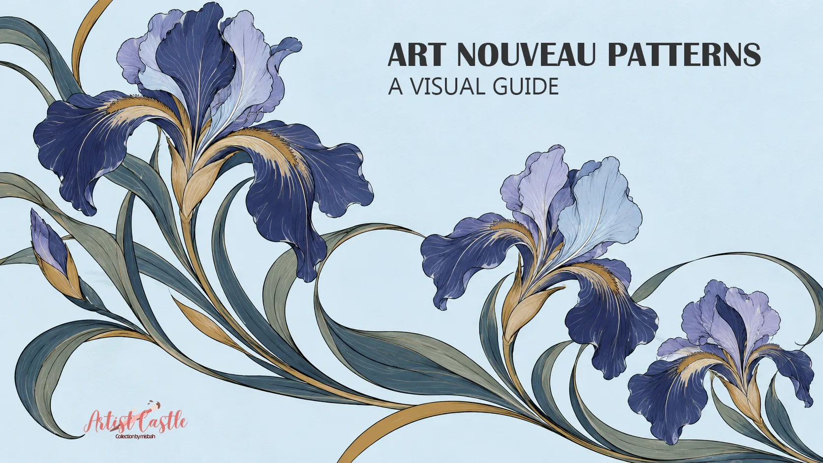
The short answer: Art Nouveau patterns are decorative designs from roughly the 1890s to the First World War. They borrow from the natural world (stems, buds, tendrils, even sea life) and turn it into flowing, stylized lines. Their best-known trait is a long, curving “whiplash” line, but the style also has more geometric sides.
This guide covers common tendencies, not strict rules, so you can recognize the look and borrow ideas for your own art or home.
What “Art Nouveau” means
“Art Nouveau” is French for “new art.” The name first appeared in a Belgian journal in the 1880s (Met Museum). The movement itself is most often dated from about the 1890s to the First World War (V&A). Designers wanted beauty in everyday things: posters, wallpaper, textiles, glass and metalwork.
The style traveled, and it picked up local names. It was Jugendstil in Germany and Sezessionstil in Austria. In Italy it was Stile Floreale or Liberty, and in Barcelona it was part of the Modernista movement. In the United States it was sometimes called the “Tiffany Style,” after Tiffany’s glass (Met Museum). Think of it as one family with regional accents.

Design terms worth separating
Pattern conversations get confusing because several different ideas share one vocabulary. Here is how this guide uses them:
- Style: a historical look shared by a group of designers, such as Art Nouveau, Arts and Crafts, or Art Deco.
- Theme: the broad subject area, such as botanical, celestial, or coastal.
- Motif: a single element within a design, such as a poppy, a leaf, or a shell.
- Motif arrangement: how the motifs are placed in relation to each other. They might be scattered, climbing in a column, grouped in clusters, or spaced evenly over the surface.
- Symmetry: matching forms across an axis or around a center. Asymmetrical designs lack that matching structure but can still feel balanced.
- Repeat structure: the underlying tiling that lets a design cover a wall or a length of fabric. In a straight repeat, each tile sits directly beside the next. In a half-drop repeat, every other column shifts down by half a tile.
These are separate choices. A botanical theme does not make a design Art Nouveau, since a poppy can be drawn in any style. An asymmetrical design can still repeat neatly.
Tendencies to look for
None of these is a test a design must pass. They are patterns that show up often.
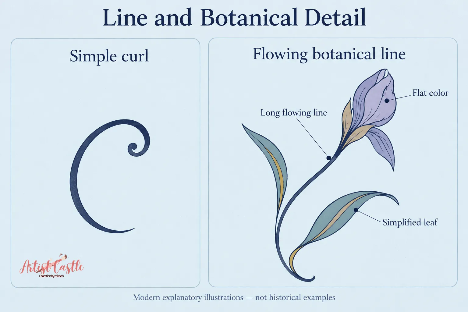
1. A line with energy. The V&A describes the whiplash as an ornamental S-curve that writhes and coils, drawn from studies of the natural world, including deep-sea organisms and botanical gardens (V&A). It appeared in textile patterns, borders, glass, and jewelry.
2. Nature, simplified. Stems, tendrils, buds, and vines are common. They are usually stretched, softened, or flattened rather than drawn like a botanical illustration.
3. A flatter, more graphic look. Japanese art was a major influence, and the Met points to its two-dimensional compositions (Met Museum). Many designs favor clear outlines and flat color over deep shading.
4. Often asymmetrical. The V&A describes the whiplash curves of architects Victor Horta and Hector Guimard as sinuous and asymmetrical (V&A). That is a tendency, not a rule.
5. Sometimes geometric. Not everything curves. The V&A’s own summary lists “eccentric geometry” alongside swooping lines (V&A). Designers worked across many countries, and results varied.
Overlaps with Arts and Crafts and Art Deco
Neighboring styles share a lot with Art Nouveau, so don’t expect clean borders.
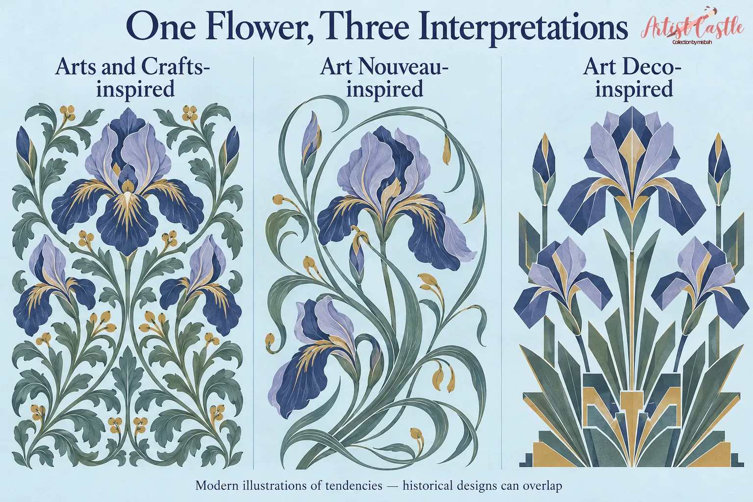
Arts and Crafts. The Met describes Art Nouveau as growing partly out of the Arts and Crafts and Aesthetic movements (Met Museum). William Morris designed wallpapers built on plants, and his designs balance natural forms with order. The V&A calls them stylised evocations, not literal copies (V&A).
A fair rule of thumb: Morris-style patterns often feel steady, with growth organized into a clear structure. Art Nouveau lines more often feel like they swing.
The two could also share a room. Cooper Hewitt describes an early-1900s home guide that promoted Arts and Crafts-style plainness yet pictured an Art Nouveau-style wallpaper in its model interior (Cooper Hewitt). A c. 1905 New Jersey wallpaper by Albert Ainsworth shows the blend. The museum describes its poppies as having a flat, Art Nouveau look and suggests the designer knew the work of Morris and Walter Crane (Cooper Hewitt).

Art Deco. Art Deco is generally tied to the years between the world wars. The Met says it matured after the First World War and peaked around the 1925 Paris decorative arts exposition (Met Museum). It calls ornament one of Art Deco’s defining characteristics, and says popular motifs included flowers and plants alongside abstract geometric decoration. It also notes that many designers borrowed the abstracted shapes of Cubism.
Flowers alone, then, don’t settle the question. A Met record for Art Deco textile designs from about 1930 describes semi-abstract roses and other flowers alongside geometric triangles (Met Museum). A better clue is what builds the design: flowing curves, or angular, geometric forms.
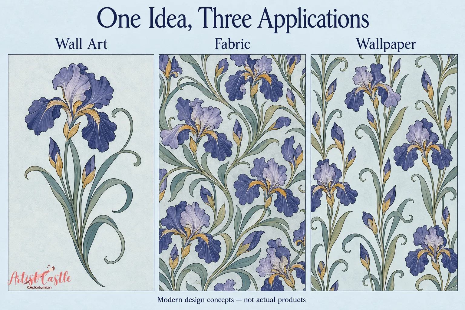
Art Nouveau patterns on wall art, fabric, and wallpaper
Each format has its own history and its own practical questions. The historical notes come from the museums cited. The practical points are modern advice, not documented historical practice.
Wall art
Posters were a big part of the movement. The V&A notes that Alphonse Mucha’s posters were prized by collectors and displayed in private homes (V&A).
Modern advice:
- Pick a focal point. One strong curve, bloom, or cluster gives the eye a place to land.
- Think about margins. Curves often look best with open space around them, and a frame or mat changes how much room they get.
- Check line detail at the display size. Very thin lines can disappear in a small print, and heavy ones can feel crowded in a large one. Preview the design at the size it will hang.

Fabric
The V&A lists textile patterns among the places the whiplash appeared (V&A).
Modern advice:
- Motif scale. Choose the scale for the use, such as a cushion, curtain, or trim. A large motif can suit one project and a small motif another, so neither is automatically better.
- Direction. Notice whether the motifs have a clear top and bottom or can be turned any way. That affects how the design looks once it is used.
- How it reads across a larger area. View the design as a big spread, not one swatch. Flowing lines can create a pleasing rhythm or start to feel busy.
For more on how repeat tile size and motif scale differ, see our guide to pattern repeat size vs. motif scale.

Wallpaper
Cooper Hewitt notes that American makers began producing Art Nouveau-style wallpapers in the mid-1890s. This followed London designs by C.F.A. Voysey and Walter Crane being shown at the 1893 Columbian Exposition in Chicago (Cooper Hewitt). It also describes Ainsworth’s wallpaper as very large in scale, which it calls typical of American Art Nouveau designs (Cooper Hewitt).
Modern advice:
- Judge it at room scale. A pattern that looks delicate up close can read very differently from across the room.
- Consider visual density. Open designs with plenty of background feel calmer. Dense ones can dominate a space.
- Ask for a sample where available. See it in your own light and next to your own colors before committing.
One more point: wallpaper is designed to cover large areas, so most designs repeat in some way. A repeat alone doesn’t reveal the style. Look at the line and the shapes.
Starting ideas for creators (modern advice)
- Start with one plant. Sketch it, then reduce it to a few key shapes.
- Let one line lead. A single long curve gives the eye a path.
- Leave breathing room. Curves read better with calm space around them.
- Keep the palette small. Try three or four colors plus a background. A deep green with one warm accent is one option.
- Check it small. Fine curves can lose their charm when shrunk, so view your design at thumbnail size.
- Mix with care. A curved motif inside a simple border can add structure without losing the flow.
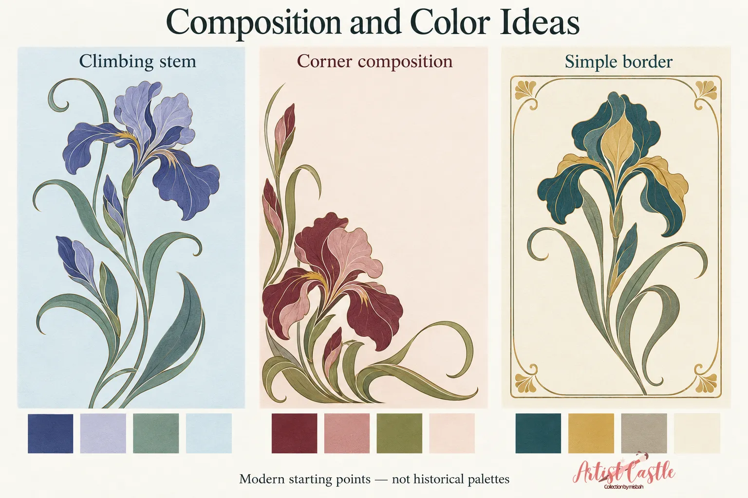
Questions for buyers (modern advice)
- Do you want a historical piece or a modern design inspired by the style? Descriptions use “Art Nouveau” in different ways, so look for plain wording such as “original,” “reproduction,” or “inspired by.”
- How does the line move? Does it flow and sweep, or sit still?
- How much stylization do you like? Some designs stay close to a plant, others are very abstract.
- What is the scale? Large patterns can feel bold in a small room.
- What else is in the space? Think about how it sits with your other styles.
- How do the colors look in your lighting? Samples or swatches, when available, help.
Quick FAQ
Is Art Nouveau always floral?
No. Nature is a broad starting point. The V&A mentions deep-sea organisms among the sources of the whiplash (V&A). Geometry also appears.
Does an Art Nouveau wallpaper have to repeat in a certain way?
No. Repeat structure is a layout choice, separate from style. You can’t tell the style from how a pattern tiles, or judge the tiling from a single photo.
How can I tell Art Nouveau from Art Deco?
Look at what builds the design. Flowing, swinging curves lean Art Nouveau. Angular, geometric building blocks lean Art Deco. Many designs, including florals, borrow from both.