The short answer
Exploring art styles and patterns for designers starts with separating technique, subject, historical influence, and arrangement.
Most designs are built from several separate choices, and the choices don’t lock each other in. You pick a technique (how it’s made), a subject (what it shows), an arrangement (how it’s laid out), sometimes a tradition to draw from, and a theme or audience/use that organizes the project.
A fern in gouache, laid out in a half-drop repeat for wallpaper, involves all of those at once. Change one and the rest can stay put. The same fern could be a single line drawing for a framed print, or a block-print-style repeat for fabric.
That is the idea behind this guide. It won’t tell you which style to pick. It shows how the options differ, so you can choose a direction on purpose.
A quick category map
Use these five questions to sort any idea:
- How is it made? Techniques and visual approaches.
- What does it show? Subjects and pattern families.
- Where does the look come from? Movements and traditions.
- What is it about, and who or what is it for? A theme is subject matter or an organizing idea, like coastal or seasonal. An audience or use describes who or what the design is for, like a nursery.
- How is it arranged? Layouts, repeats, scale, and density.
Techniques and visual approaches
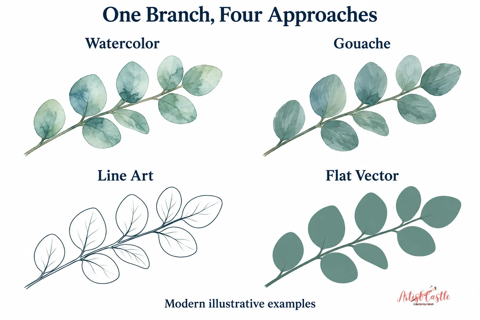
Watercolor and gouache
Watercolor often uses transparent washes. Light comes through the paint, so colors layer into soft overlaps, and edges can bloom where wet paint meets wet paper. It rewards looseness. The trade-off is that its subtle gradients can be hard to reproduce faithfully on fabric or wallpaper, so check a scan or test print before committing.
Gouache is typically opaque. It dries to a flat, matte finish, and you can paint light colors over dark ones. It can also be diluted into washes, so the two paints overlap more than people expect. If you like crisp shapes with solid color, gouache is a natural fit.
A starting idea: paint the same eucalyptus branch twice. Do one version in loose watercolor washes and one in flat gouache, then compare how each reads at thumbnail size.
Line art and collage
Line art builds an image from lines rather than filled areas. Weight and rhythm do the work. Thick-to-thin variation gives a drawing personality, while even, uniform lines feel modern and calm. Line art can sit well on a large white wall print. In a pattern, the open space between lines becomes part of the design, so test how the background shows through.
Collage assembles layers of shape and texture. That might be cut paper, scanned fabric, torn tissue, or digital layers made to look that way. A starting idea: scan three papers you like, cut simple leaf shapes from each, and overlap them on a neutral ground.
Flat vector shapes
Flat vector art uses solid-fill shapes with crisp edges. You can make it in any vector tool. It scales cleanly and edits easily, which is handy when you want to try several color versions.
Clean edges are the default, and they suit modern, graphic work. If you want a more handmade character, you can add optional texture, such as a subtle grain overlay or slight irregularity along the edges. Decide whether you want crisp or textured edges before you build the rest of the artwork.
Block printing and the block-print look
Historically, block printing used carved wood blocks to stamp color onto cloth (Met). William Morris’s wallpapers were mostly printed from hand-cut woodblocks (V&A). A digital block-print look borrows the visual cues: slightly uneven edges, bold simplified shapes, and a small number of flat colors.
It’s an interpretation, not a reproduction of the process. A starting idea is a chunky leaf with visible “carving” marks in the negative space, in two colors on an off-white ground.
Minimalism, and naturalistic versus stylized
Minimalism is an approach rather than a subject. It strips a design down to a few forms and lets empty space do part of the work. It works with almost any subject, from a single branch to a pair of arcs.
Naturalistic versus stylized is another choice that cuts across everything else. A naturalistic design stays close to how things look. A stylized one simplifies or reshapes them. Morris’s wallpapers are a useful example of the range: some are luxuriantly naturalistic and others flatter and more formal, but they are stylized evocations of plants, not literal copies (V&A).
Subjects and pattern families
Floral and botanical
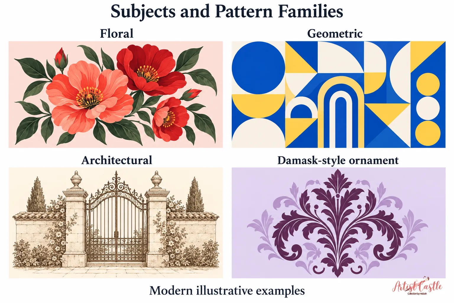
Floral usually points to flowers. Botanical covers plants more broadly: leaves, ferns, seed pods, stems, and branches. The line between them is blurry, and neither term requires scientific accuracy. Botanical-style art can be exact, loose, or invented. The Met notes that Mughal flower designs were naturalistic yet altered for aesthetic reasons and are not botanically correct (Met). Starting idea: draw three leaf shapes from one plant at different sizes. That gives you an easy range of scale for a pattern or a print.
Geometric and abstract
These two words overlap, but they describe different things.
Abstract art doesn’t try to give an accurate picture of visual reality. It can start from a recognizable subject, such as an object, figure, or landscape, and simplify or transform its forms. It can also use shapes, colors, and gestural marks with no source in the visible world. That second kind is nonrepresentational, sometimes called non-objective, and has no recognizable subject (Tate).

Geometric describes the use of geometric forms: circles, grids, triangles, arches. A design can be geometric and abstract, geometric and nonrepresentational, or geometric and still clearly representational.
A few examples:
- A cactus built from triangles is geometric, and it’s an abstracted version of a recognizable subject.
- A grid of overlapping circles is geometric and nonrepresentational.
- A loose brush-stroke composition can be nonrepresentational without being geometric.
- A neat row of simplified fan shapes could be geometric while still reading as a recognizable object.
Starting idea: take one arch shape, vary its size and color, and arrange it as a loose cluster. Then decide whether you want it to stay a recognizable arch or turn into pure shape.
Architectural
Architectural subjects include arches, columns, windows, rooflines, and garden gates. They bring structure and rhythm without needing figures. They also suit line drawing well. Starting idea: draw a row of arched windows, then pick two or three to use as repeatable motifs.
Toile-inspired
Toile de Jouy is a monochromatic pictorial printed cotton named for the French town where it was made. The Met’s example combines architectural scenes with figures (Met), and the same page notes that the Jouy factory’s printing techniques also reproduced floral and geometric patterns. Scenes can be built from architecture, landscape, or plants, with or without people.
We use “toile-inspired” for contemporary work that borrows the look: one ink color, small scenic vignettes, and plenty of space around them. The label reflects that it’s a modern interpretation, not a reproduction of historic cloth. Starting idea: draw three vignettes, such as a garden pavilion, a bridge, and a conservatory, in one color on a light ground.
Damask-style ornament
Damask is a woven, reversible patterned fabric where lustrous and matte areas contrast (UAlberta Museums). A damask-style print can suggest that kind of ornament through formal, scrolling, often symmetrical motifs, without reproducing how the cloth is woven. A starting idea is a single vertical medallion built from leaf forms in one color.
Historical movements and traditions
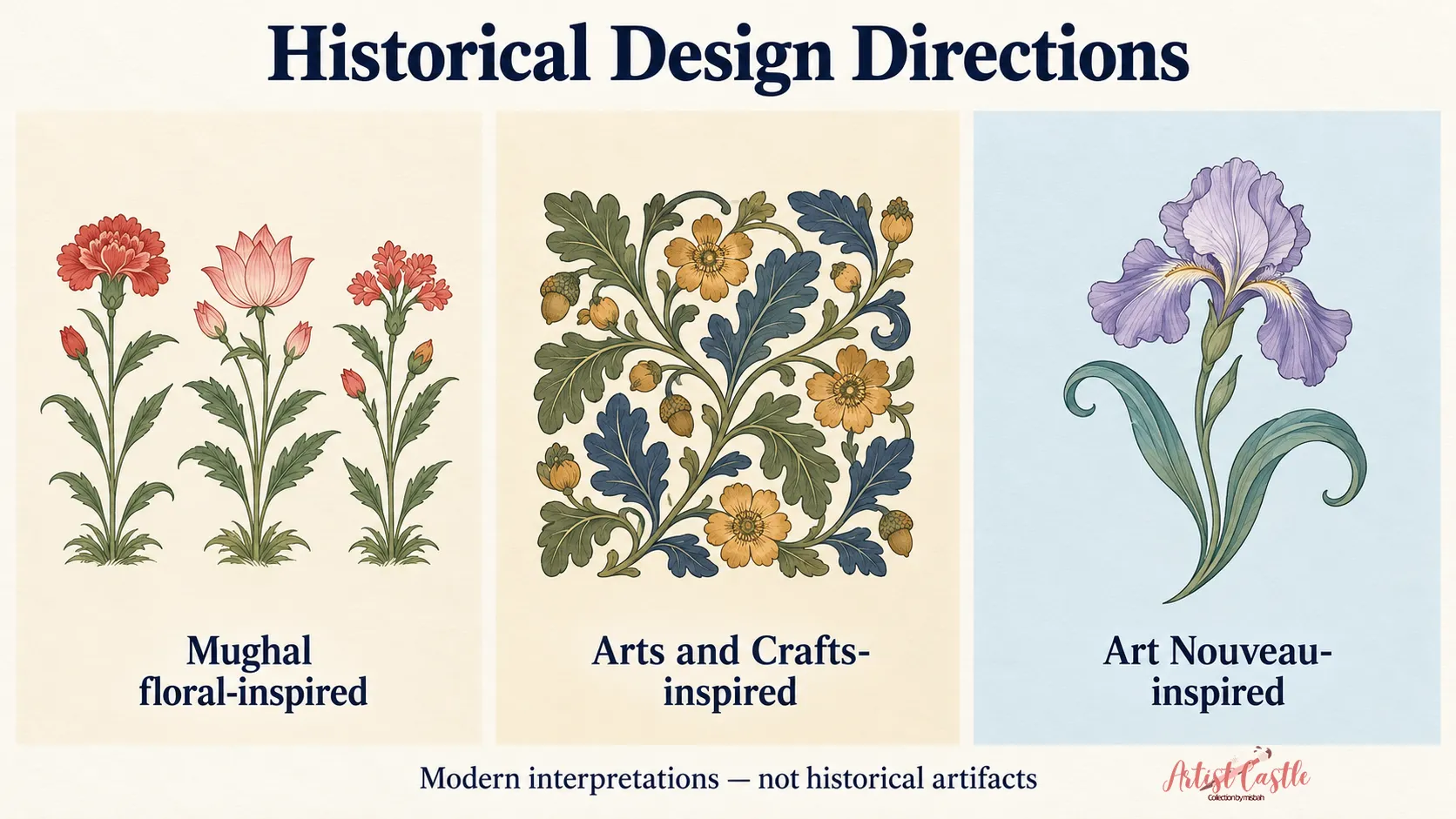
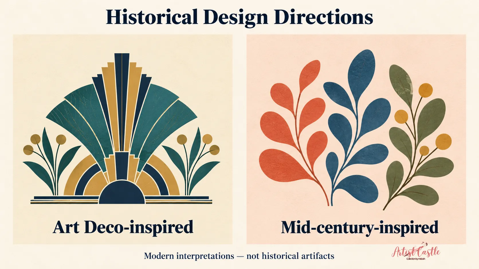
The illustrations for this section are modern interpretations. They aren’t historical artifacts, and they shouldn’t be used as evidence of what these movements looked like.
Mughal flower style
Under the emperor Shah Jahan, textiles carried formally arranged, naturalistic flowers on a plain ground. The Met describes this as a distinctly Mughal style that developed when European herbal illustrations influenced traditional Indian depictions of nature (Met). It is one phase of a much larger tradition, so avoid using it as shorthand for all Mughal design.
For a designer, the useful takeaway is about arrangement: single plants set in orderly rows on a calm background. The rows leave a lot of breathing room.
Arts and Crafts
Arts and Crafts was a broader movement concerned with craft, design reform, and an alternative to industrial production. William Morris is its best-known pattern designer. His wallpapers center on plant forms, and the V&A describes some as flatter and more formal and others as more naturalistic (V&A). A starting idea: draw leaves that curl and overlap in a loosely woven composition. Dense work like this suits wallpaper at a larger scale, but test it in a real room, since big patterns can overwhelm small walls.
Art Nouveau
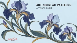
Art Nouveau drew heavily on the natural world. The Met explains that its whiplash curves came partly from botanical studies and illustrations of deep-sea organisms, and that the style grew out of the Arts and Crafts and Aesthetic movements (Met). Look for long, flowing lines and plant stems that curve and snap back. Starting idea: one tall iris-like stem with a single sweeping curve, in line art. Our Art Nouveau patterns guide goes deeper on this style.
Art Deco
Art Deco is often reduced to “geometric,” but the Met describes ornament as one of its defining characteristics. Its recurring motifs include plants and flowers alongside abstract geometric decoration, and designers borrowed simplified shapes from Cubism (Met). That makes it flexible: you can draw on stylized plants, fan shapes, or stepped forms. A starting idea is a fan motif built from concentric arcs.
Mid-century modern
Mid-century modern covers a wide stretch of postwar design. One strand the Met points to is biomorphic, nature-derived abstract forms, along with new materials and the formal vocabulary of modern art (Met). That is only one strand, so avoid treating biomorphic shapes as the whole definition. For a modern take, think simplified leaf shapes, asymmetrical balance, and uncluttered composition.
Themes and audiences
Themes and audiences are editorial categories. They help organize ideas, but they don’t prescribe a look.
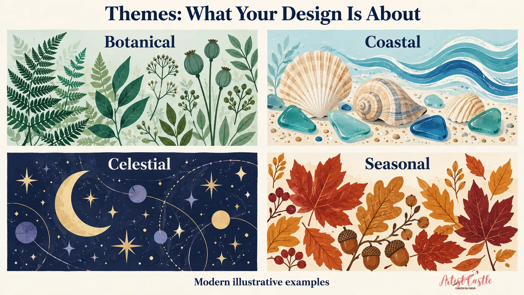
Botanical, coastal, celestial, and seasonal are themes. A theme is subject matter or an organizing idea, and each one can take any technique or layout:
- Botanical: ferns, grasses, leaves, branches.
- Coastal: shells, sea glass, waves, rope textures, harbor lines.
- Celestial: star charts, crescents, orbits, constellation lines.
- Seasonal: autumn leaves, spring buds, winter branches.
Nursery is different. It describes an audience and a use: a room for a baby or young child. It doesn’t dictate a subject, and not every subject is automatically suitable for children. Check each design with that room in mind. For example, consider how bold or detailed it is, and whether it works at the size and distance it will be seen.
Arrangement, symmetry, repeats, scale, and density
Arrangement is where many designs succeed or fall apart, but it’s a separate choice from style. Here are the key terms. Some describe how a tile is built, and others describe how motifs sit inside it.
Single composition. A wall art print is often one composition. It does not need to repeat, though it can contain repetition inside it, like a row of arches or a grid of dots.
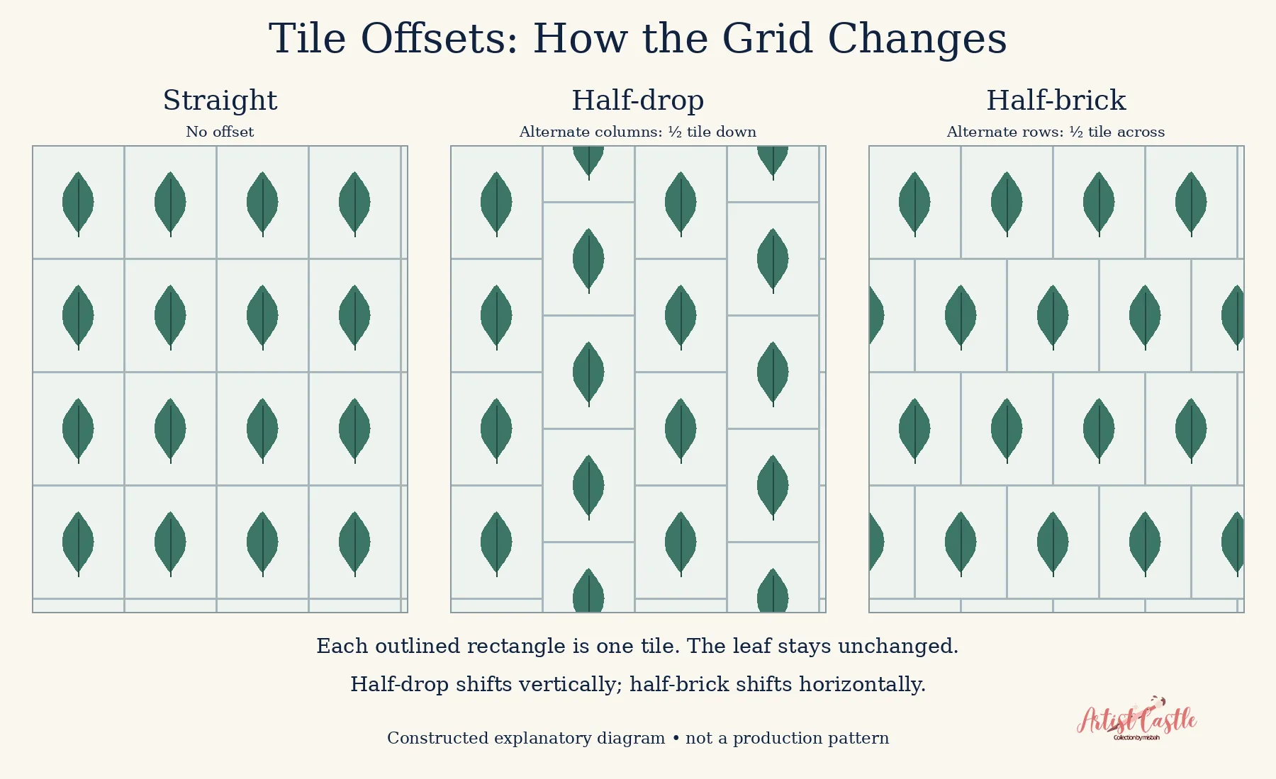
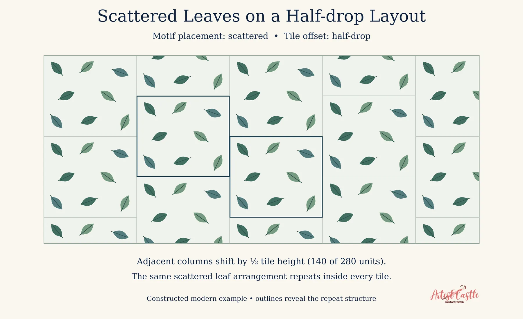
Straight and staggered repeats (tile offsets). In a straight repeat, tiles line up in rows and columns. In a half-drop, every other column shifts down by half a tile, which can make rows less obvious. Repetition can still show, depending on your motifs and spacing. A half-brick does the same sideways. Surface-design platforms name these similarly, as in Spoonflower’s repeat options.
Mirror arrangements. Here a motif is reflected across one or more axes, so the pattern is symmetrical. Platforms may implement this differently. Spoonflower’s mirror option, for example, reflects across both directions.
Tossed arrangements (motif placement). Tossed describes how motifs are placed inside a tile: spaced unevenly and turned at different angles to create a scattered effect. It’s a placement choice separate from tile offset, so a tossed arrangement can sit on a straight or half-drop tile. Repeats and directional cues can still show, so it’s worth looking for them.
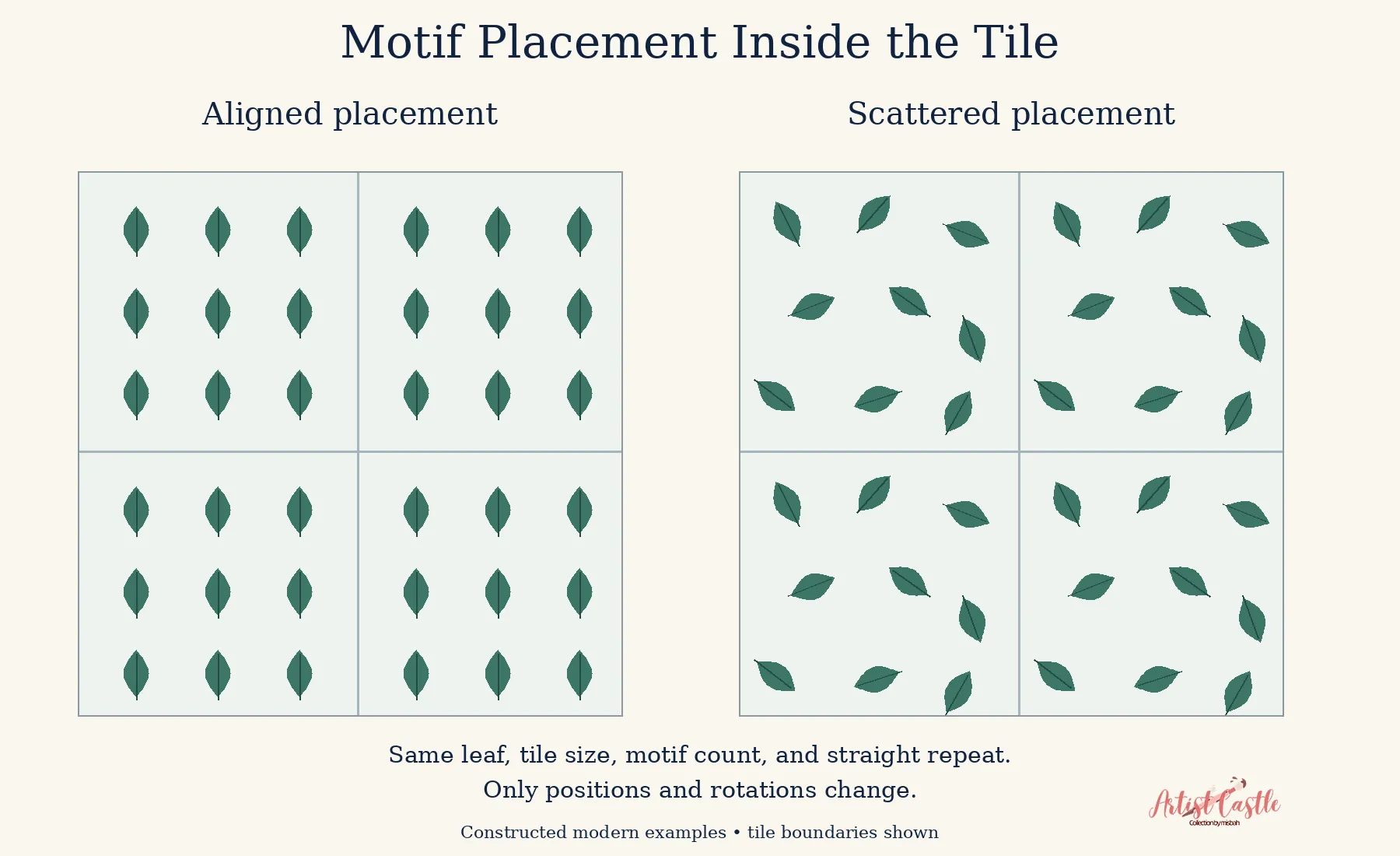
Scale and density. Scale is how big the motifs print. Density is how much of the surface they cover. Ditsy usually describes a very small-scale, scattered print, though the motifs can be spaced close together or far apart. A large-scale, sparse design reads very differently from a tiny, packed one, even with identical motifs. For more on how tile size and motif scale differ, see our guide to pattern repeat size vs. motif scale.

A practical choosing guide
Work through these questions in roughly this order:
- What product is it for? Wall art, fabric, and wallpaper are seen at different distances and sizes. Test a rough version at actual scale.
- What mood do you want? Moods are personal, so use your own reaction to rough thumbnails, not a rule. Try quick sketches in two directions.
- How do you like to work? If you enjoy painting, start with watercolor or gouache. If you prefer shape-making, start with vector.
- How full or open should it feel? Decide between a quiet, open composition and a layered, full one.
- How much do you want to take on? Scope the project before you start. Depending on your process, extra layers, colors, or colorways can add steps.
Because the choices are modular, you can test one variable at a time. Keep the subject and technique fixed while you try two arrangements, or keep the arrangement fixed while you try two palettes. When you change everything at once, it’s hard to tell what helped.
Three worked combinations
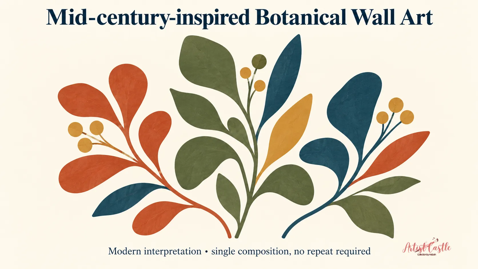
1. Mid-century-inspired botanical wall art
Ingredients: a mid-century-inspired direction, a botanical subject, and a single composition for a print.
Why it works: Biomorphic, nature-derived shapes are one strand of mid-century design. Simplifying a plant into a few confident forms gives you something clean without being empty. Wall art doesn’t need a repeat, so you can focus on balance.
Starting idea: Build three or four leaf and stem shapes in flat color, placed asymmetrically on a plain ground. A limited palette of three or four colors is a manageable starting point, and it’s only a suggestion.
Next step: Make three thumbnail layouts, then pick the one that still looks balanced at small size.
2. Small scattered leaf motifs using a half-drop repeat
Ingredients: a botanical subject at small scale, a tossed arrangement, and a half-drop tile.
Why it works: Half-drop is a tile offset and tossed is a motif arrangement, so the two can be combined. The half-drop offset shifts every other column, which can make rows less obvious. Varied placement and rotation add the scattered effect. Repetition can still show, so look for it before you finalize.
Starting idea: Draw two or three leaf shapes in two sizes, rotate them freely, and scatter them with uneven gaps inside the tile.
Next step: Build the tile, preview it at real fabric scale, and look for places where motifs repeat or line up too obviously.
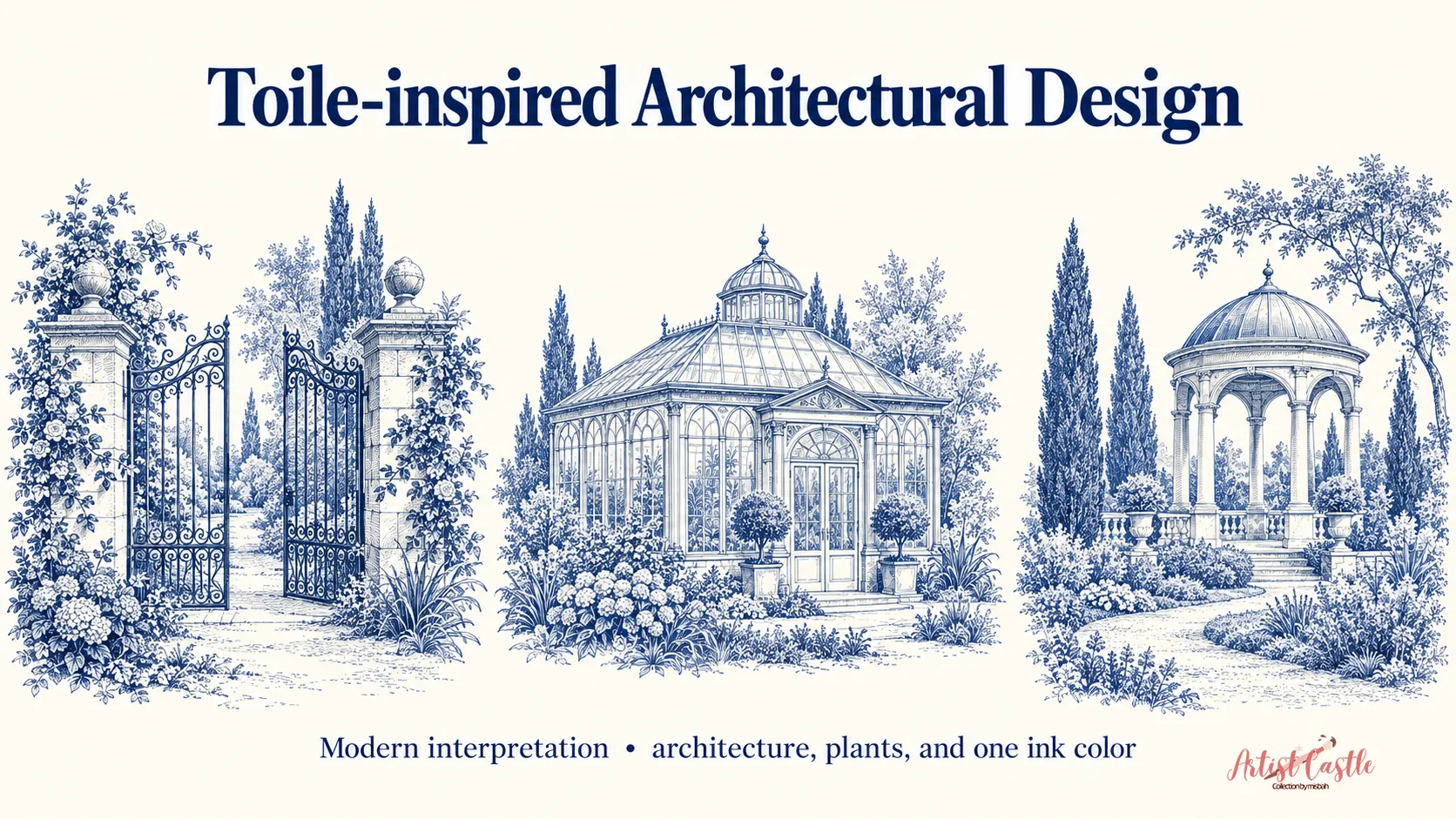
3. Toile-inspired architectural wallpaper without figures
Ingredients: a toile-inspired approach, an architectural subject, and a single ink color.
Why it works: The idea of scenic vignettes printed in a single ink color transfers well to buildings and gardens. Architectural, landscape, and botanical scenes can all appear without people. We call this one toile-inspired because it’s a contemporary interpretation of that look, not a reproduction of historic cloth.
Starting idea: Draw a few small scenes, such as an arched gate, a conservatory roofline, or a garden pavilion. Print them in one color on a light ground, with plenty of space between vignettes.
Next step: Draw one vignette in fine line, then shrink it to see whether the detail still reads at wallpaper scale.
FAQ
Do I need a repeat for wall art?
No. A single composition doesn’t have to repeat, though wall art can contain repeated elements within it.
Is tossed the same as half-drop?
No. Tossed describes how motifs are placed. Half-drop describes how tiles are offset. You can use both in one design.
Is abstract the same as geometric?
No. Abstract art can simplify or transform a recognizable subject, or it can have no recognizable subject at all. Geometric describes the use of geometric forms, and it can overlap with either.
Does botanical art have to be accurate?
No. Accurate renderings are one option. Morris’s stylized plants and Mughal flower designs show that altered, simplified, and invented plants have a long history (V&A, Met).
Can I mix movements?
You can. It helps to know what you’re borrowing from each, such as Art Nouveau’s flowing line or Art Deco’s simplified shapes, so the result feels deliberate.